
ZOE BROWNE COPY & CONTENT
Having produced freelance design work for Zoe Browne’s US clients, it was her turn to have a new identity. The approach was as friendly and approachable as Zoe herself. The palette was inspired by her San Diego home, while the letter O’s in her name were converted into speech bubbles, representing her copy and content work.

BAKE ME A GIFT
A business partnership I’d previously worked with asked me to help design an identity for their new venture, “Bake Me A Gift.” Brownies were delivered to customers in bespoke gift cards, which needed designing too... all 76 of them!

JAMES KAY ARCHITECT
In launching James Kay Architects Limited, I was briefed to design an identity reflecting the values of its founder. Simple, contemporary architecture consistently delivered. The timeless approach to the logo’s design is designed to outlast trends and fads, matching his approach to architecture
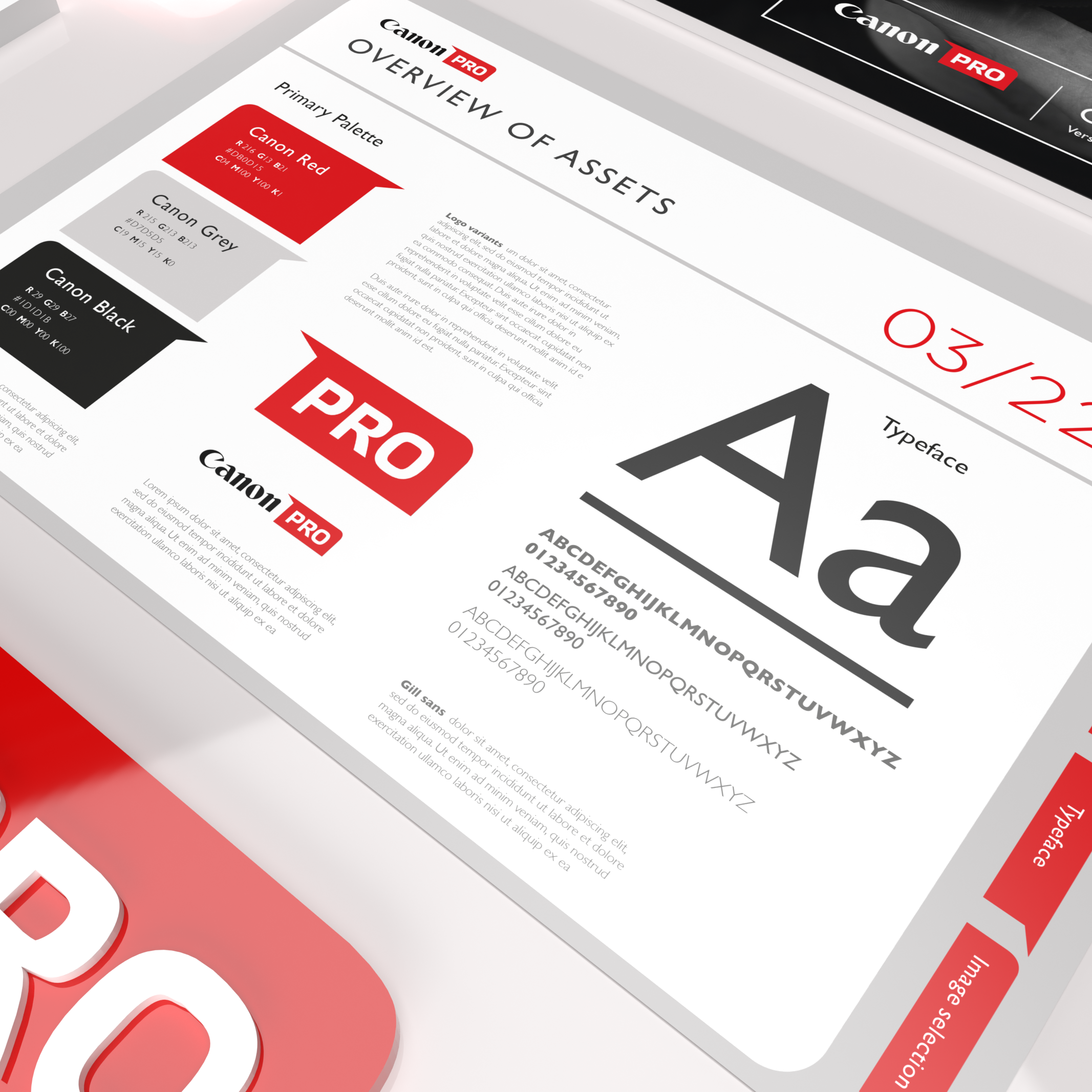
CANON PRO
We were briefed at Tag Worldwide to redesign Canon’s pro-dealer network identity as their previous version only referenced camera equipment. This selected route was an adaption of their customer facing frame device, maintaining the Canon brand look.
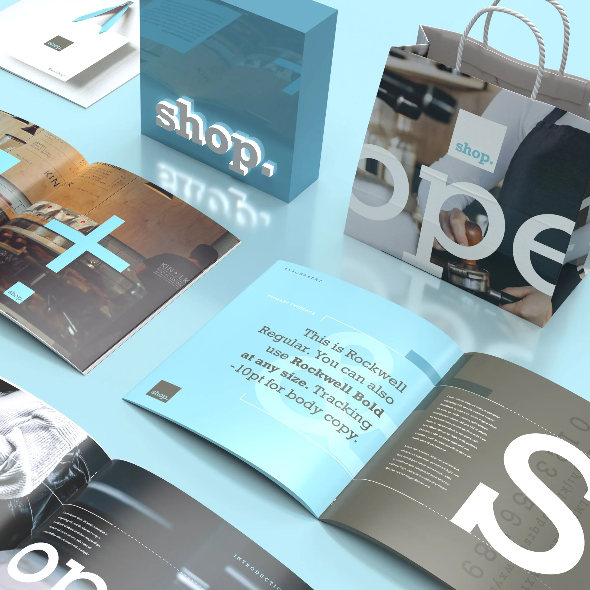
SHOP AT TAG
Creating Tag’s retail division meant shaping its identity from the ground up. The Shop logo, inspired by the traditional hanging sign, set the tone. A simple retail cue that anchored the brand. From there, the wider identity flowed naturally, extending that familiar sign language into a cohesive and distinctive visual system.